Web Content Accessibility Guidelines
To help ensure websites and apps are accessible, the World Wide Web Consortium (W3C) has developed a set of Guidelines, the Web Content Accessibility Guidelines
These guidelines are developed by industry professionals, some staff and some community members, all of which are developed publicly and openly
WCAG 2.2
The most current version of the guidlines is WCAG 2.2 which was published in October
Each version updates to take into account new technologies, for example 2.1 introduced guidelines around animations and motion, while 2.2 introduced guidelines around drag and drop and authentication
Similarly version 3 is being worked on at the moment and will incorporate additional guidelines around mobile devices and more improvements for cognitive impairments
A - AA - AAA
These guidelines cover 3 levels of conformance, A, AA and AAA
A is basic accessibility, if you’re not meeting this level people with impairments will have serious issues or be incapable of using it at all
AA goes a step further and ensures that people with impairments can use it, although it may not be convenient. If you’re working towards an accessibility standard, this is likely what you’re working towards
Finally AAA is the highest level, is typically met by organisations who’s primary user are people with impairments
Whatever role you are in, it’s worth knowing a bit about these guidelines, at the very least that they exist, what level you have to meet and how to test against them
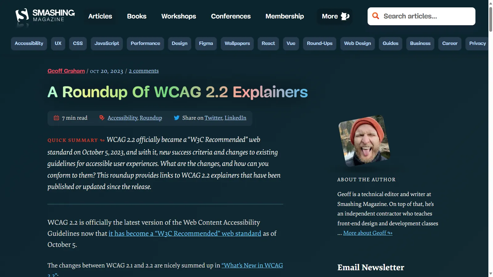
smashingmagazine.com/2023/10/roundup-wcag-explainers
As I mentioned, WCAG 2.2 came out a few months back, there are a bunch of great explainers that go through the guidelines and what the changes are
A little can go a long way
A little change can make a huge difference
If you’re using a component library, there’s a chance that one small fix can resolve hundreds or thousands of issues
49,991,225 accessibility issues
Let’s take a look again at the data from the WebAIM million audit
49 million, 991 thousand, 225 accessibility issues
96.1% easy fixes
Of those, 96.1% are easily fixable
48,041,567 easy fixes
That’s over 48 million issues that can be fixed with a small change
Colour Contrast
Missing Alt Text
Empty Links/Buttons
Missing Form Labels
Missing Document Language
These issues were from insufficient colour contrast, missing alternative text on images, buttons and links that were empty or didn’t include a label, missing labels on form inputs and missing document language
<!DOCTYPE html>
<html>
	<!-- Page Content -->
</html>
Doctype is a really easy fix
It’s literally the first line of a HTML file
Nearly 1 in 5 websites tested were missing this
Colour Contrast
More than 60% of the issues were insufficient colour contrast
WCAG guidelines have a minimum ratio of 4.5:1 to meet AA standard, and 7:1 to meet AAA standard
https://webaim.org/projects/million/ whocanuse.com
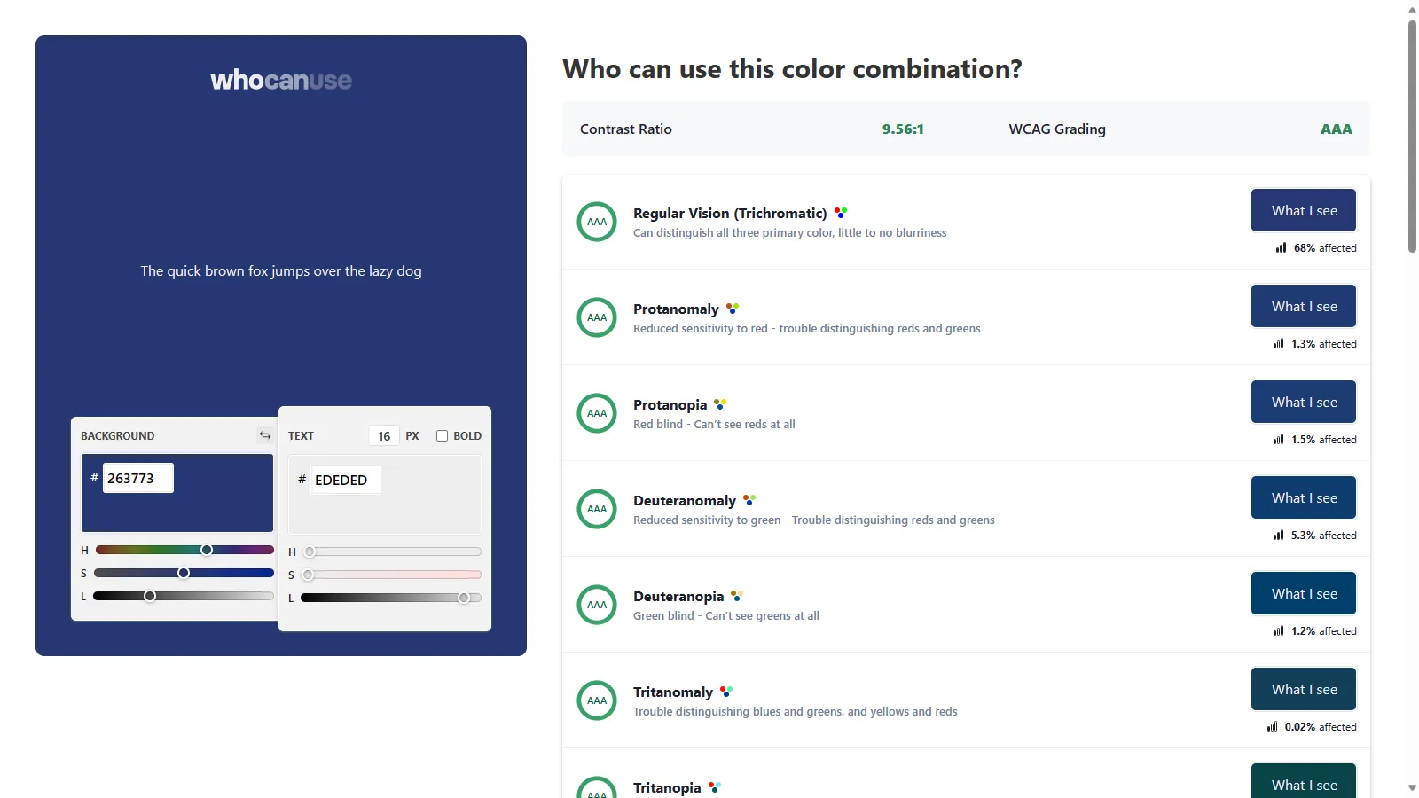
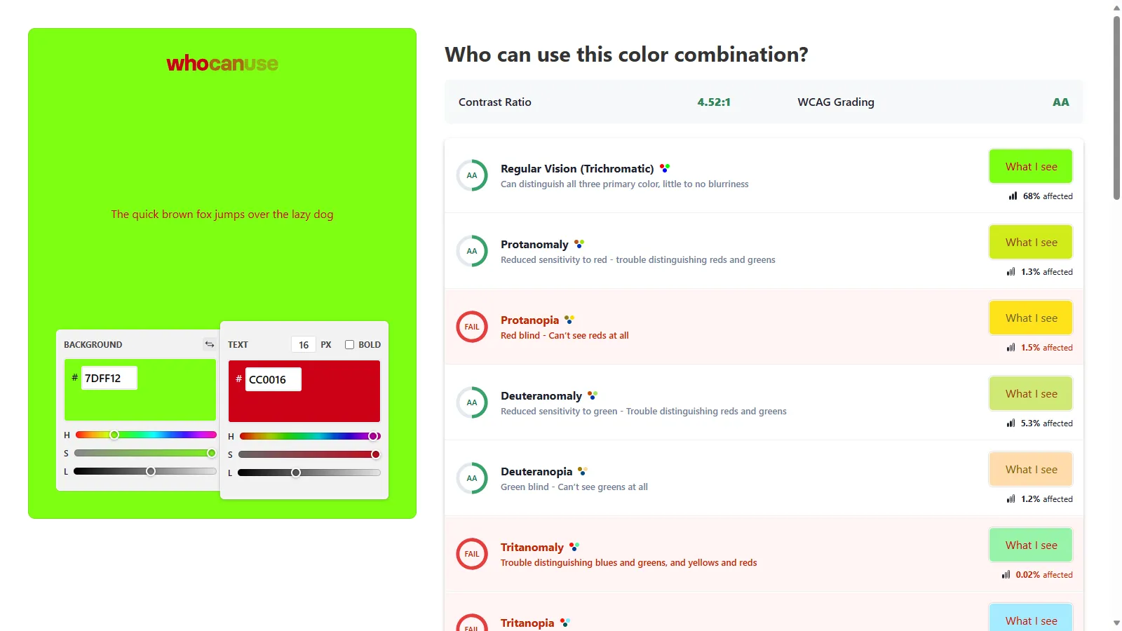
To help determine the colour contrast, there’s a great tool Who Can Use, which not only calculates the difference between 2 colours but simulates several different vision impairments and compares those too
whocanuse.com
For example, red and green may technically pass AA standard with a ratio of 4.5:1
But if people have a type of colour blindness that affects reds or greens, it may fail
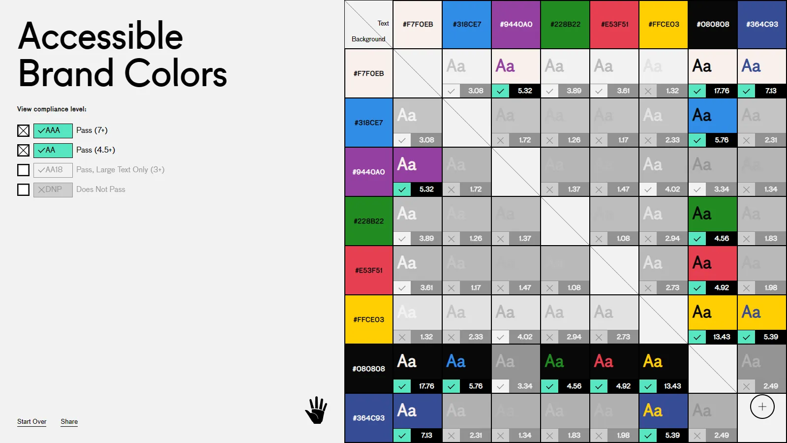
abc.useallfive.com
There are also plenty of tools out there that can compare brand colours against one another
This is useful to know which colours can be used together and still pass the colour contrast guidelines
Marketing, Content Writing, Developers Alt Text
Having a text alternative for your images
People who can’t see the image miss it
And screen readers or assistive technologies can’t describe it to them
And if a picture is worth a thousand words that’s a lot of content they’re missing
<img src="my_dog.jpg" />
If you don’t have one, the screen reader will read out the file name
Which for something like this isn’t as bad, although doesn’t give much information
<img src="/img/3c87e3e6bd8aa927c30257a/07cf2d3891f54ca470d1d9f0.jpg" />
And most of the time our images have automatically generated names or paths, which is not remotely helpful and a poor user experience
<img src="image.jpg" alt="{content}" />
Instead we can an alt attribute to the image, giving the user information about the image
This doesn’t necessarily mean describing the entire image, but describe the important parts of the image, the intent behind it’s inclusion
<img src="image.jpg" alt="" />
If an image isn’t conveying any information, and is purely presentational
We use an empty alt attribute, this lets assistive technologies know that it’s not important and they’ll ignore it altogether
Marketing, Content Writing, Developers Captions & Descriptions
As well as text descriptions for images, make sure that your other media has a text alternative as well
Videos and audio recordings can be given captions and transcripts
Again these are beneficial for people other than just those with hearing impairments, I much prefer watching videos with captions, they help me follow what’s happening better
And if I don’t have headphones, I can still watch a video with captions when I’m on public transport or if I’m at a conference and there’s a boring talk on
If you’re relying on graphs and charts, make sure there’s a text description for them as well, so people who can’t see them can still understand the information
	<canvas aria-labelledby="label" >
		<!-- Chart Here -->
	</canvas>
	<p class="hidden" id="label">
		Bar chart that shows that revenue for quarter 4 has doubled from $1 million to $2 million compared with the previous quarter due to accessibility improvements that helped widen customer base.
	</p>
You can use attributes like aria-describedby which allow you to link a description with a visual element like an image
This description doesn’t need to be visually hidden either, it may be a paragraph of content that already exists explaining it
Form Labels
Make sure that your form inputs have labels associated with each input
Even if the design doesn’t display them, you can hide the labels visually, and keep them linked so that screen readers know what each input is
<label for="i_1">
	Enter Information
</label>

<input id="i_1" name="info" placeholder="Info"/>
You can link labels with inputs using the for and id attributes
The id attribute is separate from the name, and can be randomly generated
The placeholder attribute, while it does display in the field, is not announced by or even recognised by screen readers
Automated Testing
If you’ve got an existing pipeline for automating tests, look at integrating some accessibility testing in there
Start running validations and check to make sure you’re not introducing new issues
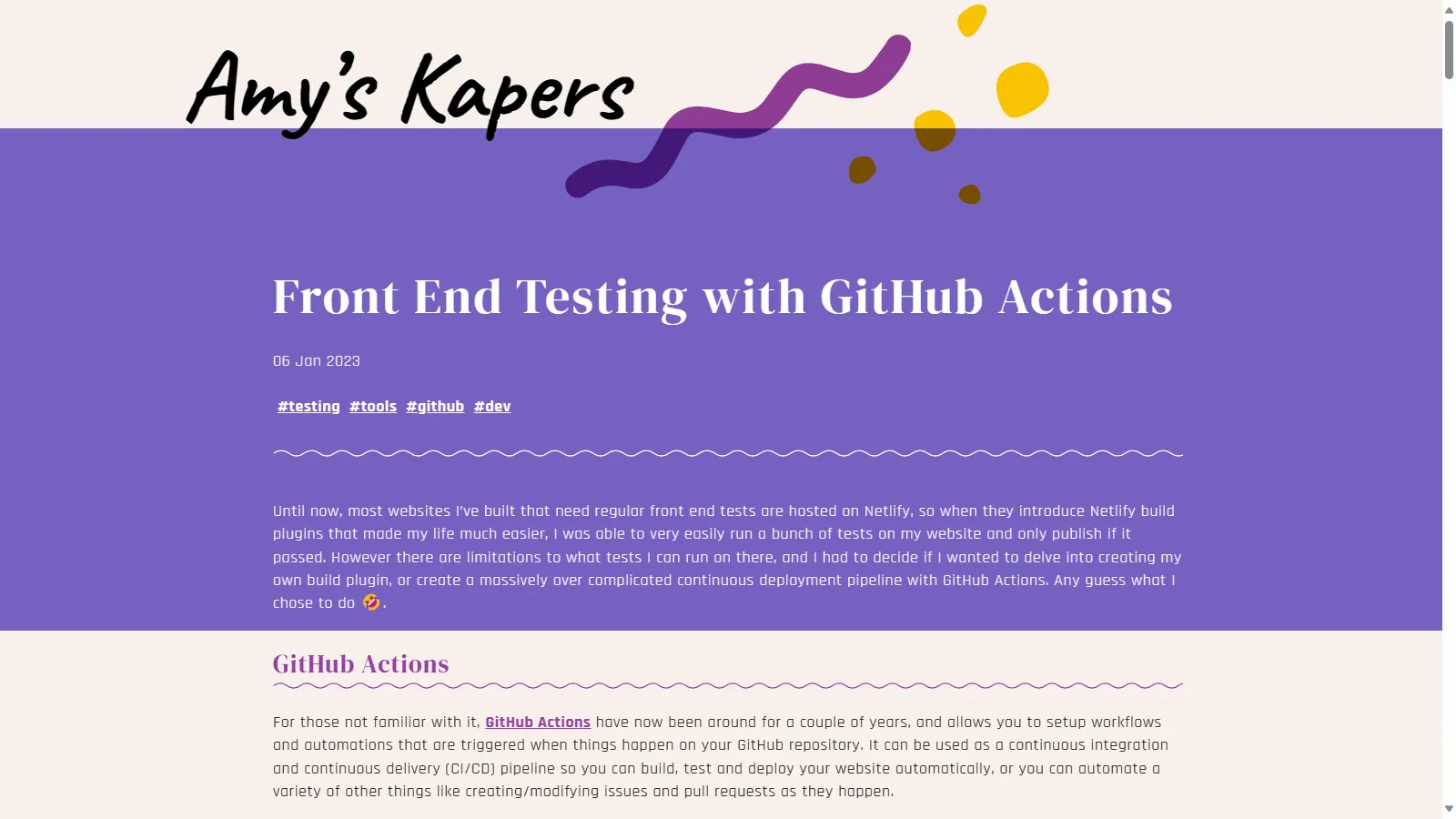
blog.amyskapers.dev/front-end-testing-with-github-actions
Or if you don’t have one, here’s a blog post to help you get started with a pipeline in GitHub Actions
Project Managers, Product Owners, Developers, QA, Testing Screen Readers
It helps to understand what people experience when using a screen reader
There are free or paid options, plus built in to Windows, MacOS, Android and iOS
Try opening up the screen reader
Navigate around the webpage, see what you can find, what you can do, what it tells you about what you can see on the page
If you’re feeling up to it, try closing your eyes and see if you can work things out without actually seeing the screen as well
Project Managers, Product Owners, Developers, QA, Testing
But while this is a useful step to do, it’s not the same as people who use screen readers every day
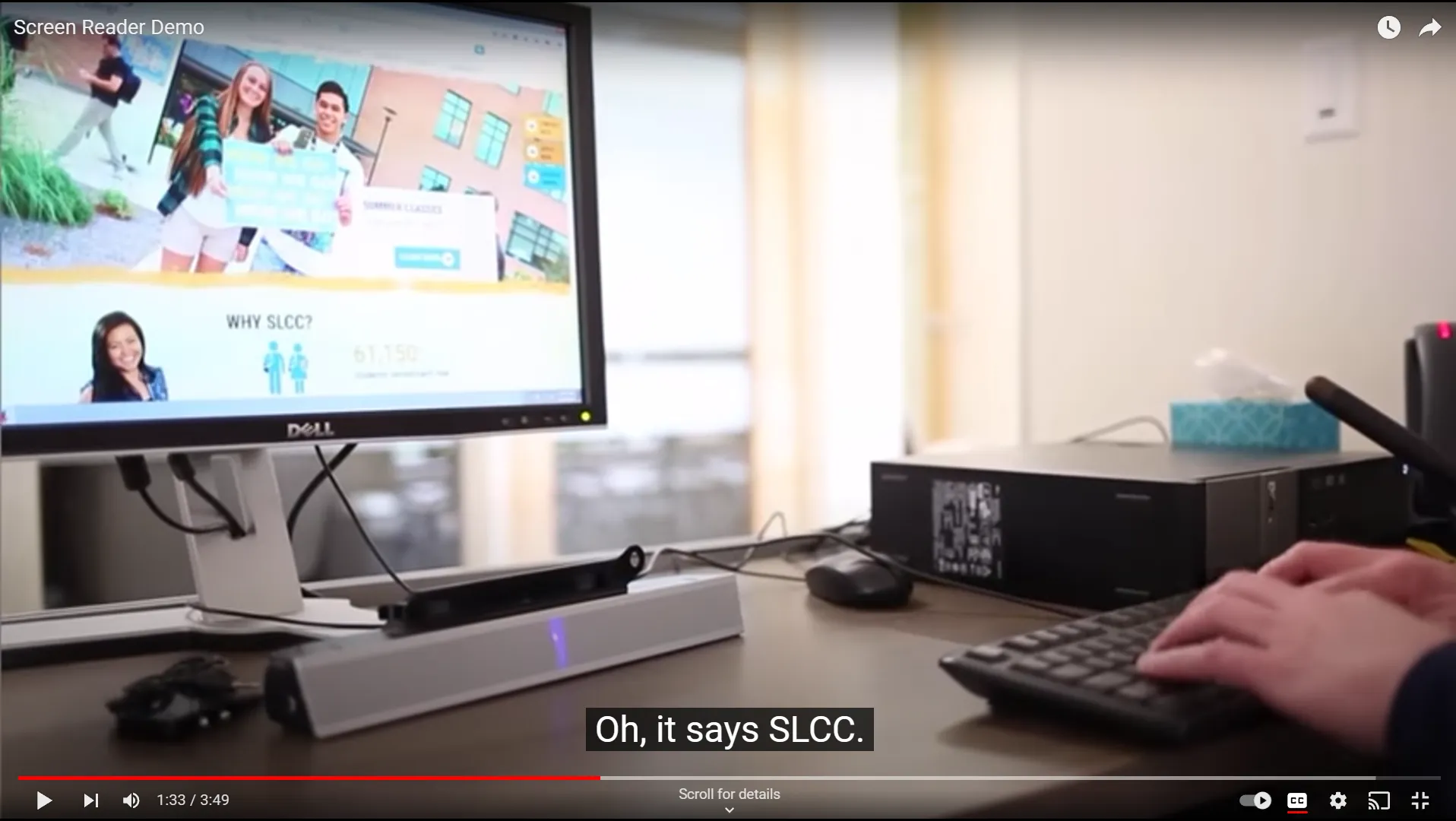
VIDEO
youtu.be/q_ATY9gimOM Project Managers, Product Owners, Developers, QA, Testing
Here we have someone who uses a screen reader every day, who relies on it to use their computer
Have a listen to how fast the voice is
youtu.be/q_ATY9gimOM Project Managers, Product Owners, Developers, QA, Testing
So get in the practice of using a screen readers
And investigate getting someone in to do it where you can
Company Leaders, Managers, HR Training
I’m going to assume that all of you know how important training and personal development is, you’ve given up your Saturdays to come and learn new things and see some amazing speakers and presentations
There’s plenty of options for training and upskilling around accessibility so find one that works for you or your team, in a format that works for them (some people prefer in person workshops, some self paced online, some books/blogs)
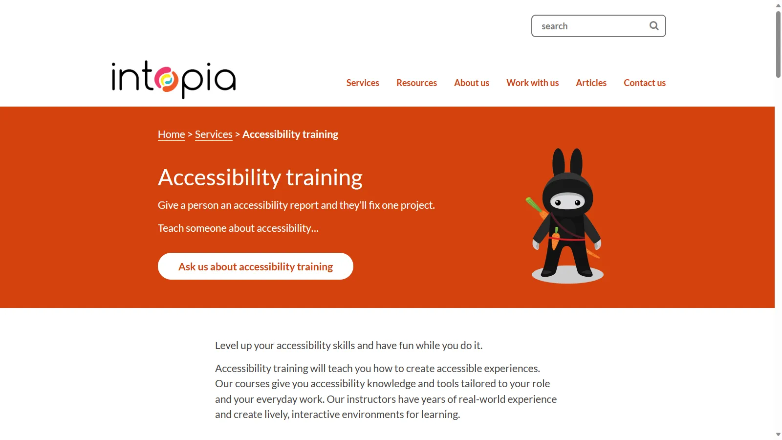
intopia.digital/services/accessibility-training Company Leaders, Managers, HR
Intopia is a digital agency that specialises in accessibility, they have a heap of different courses available
These courses target different roles and teams too, including designing, developing, content writing, testing, project management, app development and more
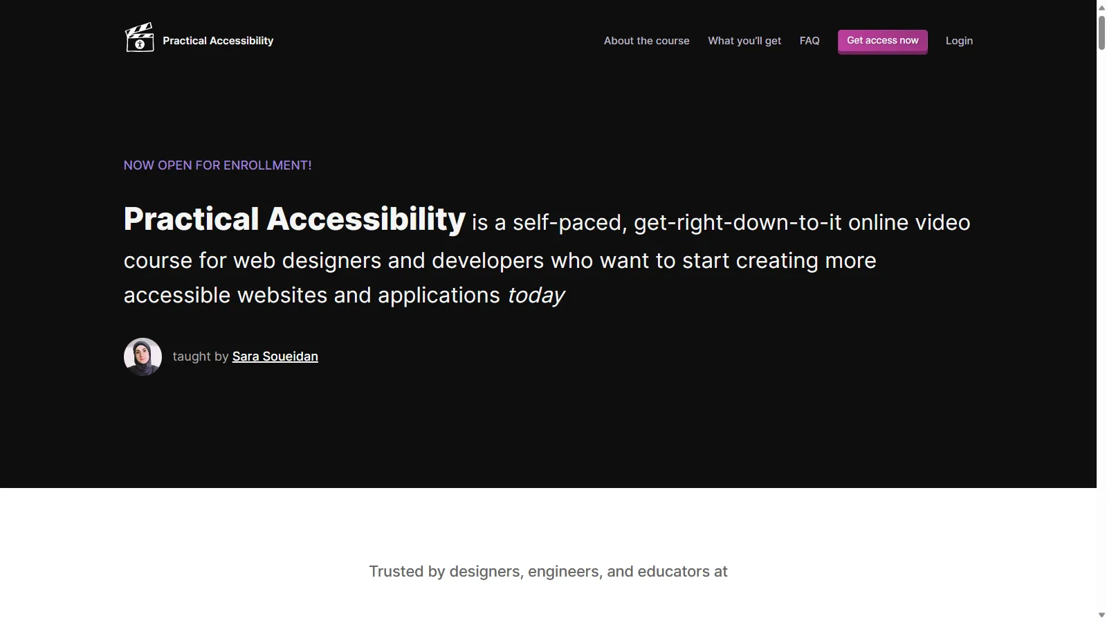
practical-accessibility.today Company Leaders, Managers, HR
Sara Soueidan has been working on this online course for a while now and it was released earlier this year
It’s targeted at developers and designers
amyskapers.dev/front-end-fundamentals-workshop Company Leaders, Managers, HR
I also have a workshop that I run in companies that covers accessibility and accessibility testing in-depth for developers and designers
Developers, Security, Project Managers, Product Owners Accessibility Overlays
I want to make a quick note about accessibility overlays and widgets
These are often used as a “quick fix” to try and make a website accesible
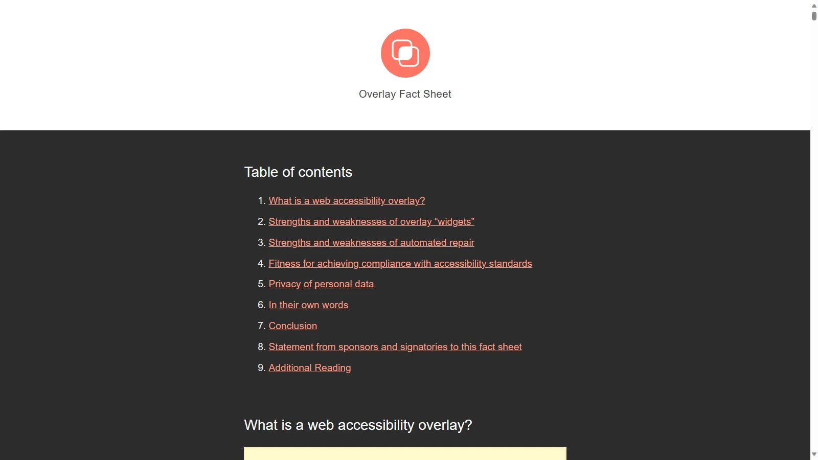
overlayfactsheet.com Developers, Security, Project Managers, Product Owners
Not only do they not fix things and make a website accessible, in many cases they make it significantly worse and override any existing settings the users might already have
They also open a site up to security concerns and potential data breaches
There’s a great factsheet about it at overlayfactsheet.com, which also includes quotes of support from accessibility experts all over


