What's New with CSS?
What's New with CSS?
CSS has changed!
Native Nesting
	.parent {
		background: chartreuse;

		.child {
			background: lemonchiffon;
		}
	}
	/* Renders out the same as */
	.parent {
		background: chartreuse;
	}

	.parent .child {
		background: lemonchiffon;
	}
	.parent {
		background: chartreuse;

		& .child {
			background: lemonchiffon;
		}
	}
.feed {
	.card {
		background: chartreuse;

		h2 {}

		ul {
			&.tags {}

			&.share {
				svg {
					color: rebeccapurple;
				}
			}
		}
	}
}
	.card {
		background: rebeccapurple;

		.feed & {
			background: chartreuse;
		}
	}
/* Is the same as */
.card {
	background: rebeccapurple;
}

.feed {
	.card {
		background: chartreuse;
	}
}
Pseudo Selectors
&:has() {}

&:where() {}

&:not() {}

&:is() {}
<div class="block">
	<p>This list has <span class="count"></span> item<span class="plural">s</span></p>
	<ul>
		<li>Item 1</li>
		<li>Item 2</li>
		<li>Item 3</li>
	</ul>
</div>
<div class="block">
	<p>This list has <span class="count"></span> item<span class="plural">s</span></p>
	<ul>
		<li>Item 1</li>
		<li>Item 2</li>
		<li>Item 3</li>
		<li>Item 4</li>
		<li>Item 5</li>
	</ul>
</div>
.block {
	--items: '1';

	.count {
		&::before {
			content: var(--items);
		}
	}

	.plural {
		display: none;
	}

	&:has(ul li:nth-child(2)) {
		--items: '2';

		.plural {
			display: inline;
		}
	}
}
.block {
	&:has(ul li:nth-child(3)) {
		--items: '3';
	}

	&:has(ul li:nth-child(4)) {
		--items: '4';
	}

	&:has(ul li:nth-child(5)) {
		--items: '5';
	}

	/* And so on */
}
<div class="field">
	<p class="error">Error: you must agree to the Terms and Conditions</p>
	<input type="checkbox" id="agree" name="agree" />
	<label for="agree">I agree to the terms and conditions</label>
</div>
.field {
	&:has(input[name="agree"]:checked) {
		.error {
			visibility: hidden;
		}
	}

	&:has(input[name="agree"]:not(:checked)) {
		outline: 5px solid var(--red);
		background: var(--red_light);
	}
}
<div class="block">
	<p>This list has <span class="count"></span> item<span class="plural">s</span></p>
	<ul>
		<li>Item 1</li>
		<li>Item 2</li>
		<li>Item 3</li>
	</ul>
</div>
<div class="block">
	<p>This list has <span class="count"></span> item<span class="plural">s</span></p>
	<ul>
		<li>Item 1</li>
		<li>Item 2</li>
		<li>Item 3</li>
		<li>Item 4</li>
		<li>Item 5</li>
	</ul>
</div>
.block {
	--items: '1';

	.count {
		&::before {
			content: var(--items);
		}
	}

	.plural {
		display: none;
	}

	&:has(ul li:nth-child(2)) {
		--items: '2';

		.plural {
			display: inline;
		}
	}
}
.block {
	&:has(ul li:nth-child(3)) {
		--items: '3';
	}

	&:has(ul li:nth-child(4)) {
		--items: '4';
	}

	&:has(ul li:nth-child(5)) {
		--items: '5';
	}

	/* And so on */
}
<div class="field">
	<p class="error">Error: you must agree to the Terms and Conditions</p>
	<input type="checkbox" id="agree" name="agree" />
	<label for="agree">I agree to the terms and conditions</label>
</div>
.field {
	&:has(input[name="agree"]:checked) {
		.error {
			visibility: hidden;
		}
	}

	&:has(input[name="agree"]:not(:checked)) {
		outline: 5px solid var(--red);
		background: var(--red_light);
	}
}
<div class="theme dark">
	<p>This section has a dark colour scheme</p>
</div>
<div class="theme light">
	<p>This section has a light colour scheme</p>
</div>
<div class="theme">
	<p>This section's colour scheme will be based on the system settings</p>
</div>
<div class="theme toggle">
	<p>This section's colour scheme will change based on the theme toggle</p>
</div>
	.container {
		&:has(.toggle input[value="dark"]:checked) {
			.theme.toggle {
				color-scheme: dark;
			}
		}

		&:has(.toggle input[value="light"]:checked) {
			.theme.toggle {
				color-scheme: light;
			}
		}
	}
	.theme {
		background: light-dark(lemonchiffon, var(--navy));
		color: light-dark(var(--navy), lemonchiffon);
		color-scheme: light dark;

		&.dark {
			color-scheme: dark;
		}

		&.light {
			color-scheme: light;
		}
	}
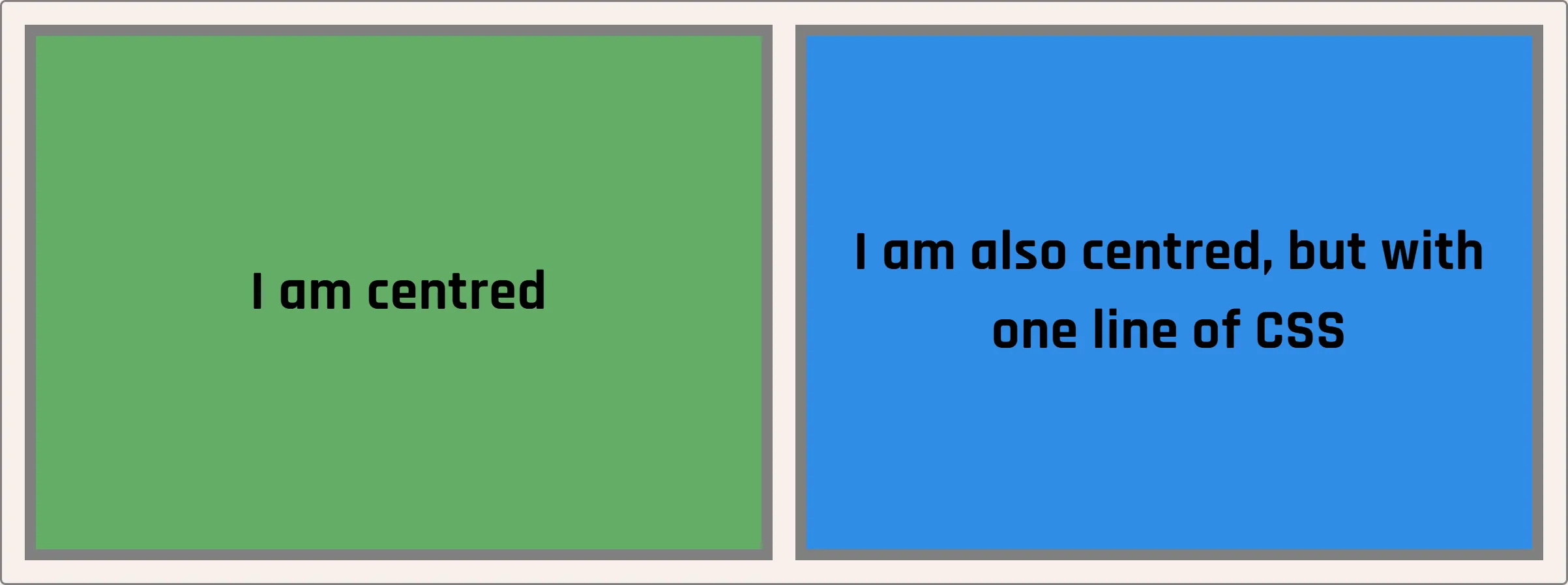
<div class="box old">
	I am centred
</div>
<div class="box new">
	I am also centred, but with one line of CSS
</div>
	.old {
		display: flex;
		align-items: center;
	}

	.new {
		align-content: center;
	}
<div class="box old">
	I am centred
</div>
<div class="box new">
	I am also centred, but with one line of CSS
</div>
	.old {
		display: flex;
		align-items: center;
	}

	.new {
		align-content: center;
	}
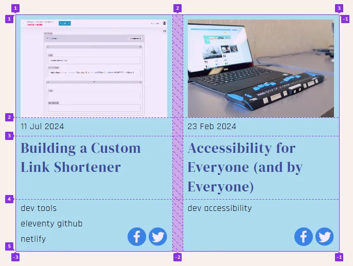
	<div class="container">
		<div class="card">
			<img src="/img/image.jpg" alt="" />
			<h2>Building a Custom Link Shortener</h2>
			<time>11 Jul 2024</time>
			<ul class="tags">
				<li>dev</li>
				<li>tools</li>
				<li>eleventy</li>
				<li>github</li>
				<li>netlify</li>
			</ul>
			<ul class="share">
				<li><svg>...</svg></li>
				<li><svg>...</svg></li>
			</ul>
		</div>
		<div class="card">
			<img src="/img/image.jpg" alt="" />
			<h2><a href="/accessibility-for-everyone" target="_blank">Accessibility for Everyone (and by Everyone)</a></h2>
			<time>23 Feb 2024</time>
			<ul class="tags">
				<li>dev</li>
				<li>accessibility</li>
			</ul>
			<ul class="share">
				<li><svg>...</svg></li>
				<li><svg>...</svg></li>
			</ul>
		</div>
	</div>
.container {
	display: grid;
	grid-template-columns: repeat(auto-fill, minmax(200px, 1fr));
	grid-auto-rows: 200px auto 1fr auto;
}

.card {
	display: grid;
	grid-template-columns: repeat(2, 1fr);
	grid-template-rows: subgrid;
	grid-row: span 4;
	gap: 10px;
	grid-template-areas:
		'image image'
		'date .'
		'title title'
		'tags socials';
}
	.card {
		img {
			grid-area: image;
		}

		h2 {
			grid-area: title;
		}

		time {
			grid-area: date;
		}

		.tags {
			grid-area: tags;
		}

		.share {
			grid-area: socials;
		}
	}
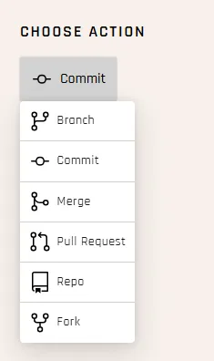
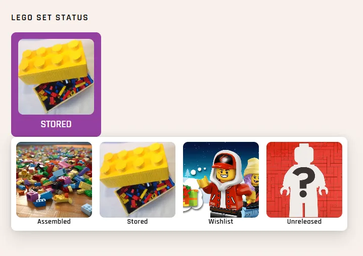
<label for="field_status">Lego Set Status</label>
<selectlist id="field_status" name="status">
	<button type="selectlist">
		<span class="sr-only">Select Tags</span>
		<selectedoption></selectedoption>
	</button>
	<listbox>
		<div class="options-container">
			<option value="" hidden>
				<span>Select Status</span>
			</option>
			<option value="assembled">
				<img src="img/assembled.jpg" alt="" />
				<span class="text">Assembled</span>
			</option>
			/* More options */
			<option value="unreleased">
				<img src="/img/new.jpg" alt="" />
				<span class="text">Unreleased</span>
			</option>
		</div>
	</listbox>
</selectlist>
	selectlist {
		button {
			&[type="selectlist"] {
				padding: 0.5em;
				border-radius: 10px;
				margin: 0;
			}
		}

		.options-container {
			display: flex;
			flex-wrap: wrap;
		}
	}
	option,
	selectedoption {
		display: grid;
		border-radius: 10px;
		cursor: pointer;
		gap: 2px;
	}

	option {
		&:hover,
		&:focus {
			background: var(--purple_bright);
			color: var(--white);
		}

		&[hidden] {
			display: none;
		}
	}