We acknowledge the traditional custodians of this land, the Kaurna people.
The world around us is changing
The web we build is changing
CSS hasn’t changed at all in the last 20 years
Anonymous comment on YouTube
But according to an Anonymous commenter on a YouTube recording of one of my talks, CSS hasn’t changed at all in the last 20 years
It’s worth noting that this talk was on CSS Grid, and the first 5min of the talk was a history lesson on how CSS has changed since we used to use tables for layouts
CSS has changed!
So I’m here today to talk about how CSS has changed, not just in the last 20 years but even more so in the last 5 years since I gave that talk
And in case anyone is feeling overwhelmed at how to possibly try and keep up with all these changes, it’s ok to just not sometimes
In fact while doing the research for this talk, I came across 3 different new things that I hadn’t even heard of or didn’t know where even close, and I work in this space almost every day
Native Nesting
Who here uses a CSS pre or post processor for writing styles
I would use one on pretty much every project and 95% of the reason for using it was for nesting
	.parent {
		background: chartreuse;

		.child {
			background: lemonchiffon;
		}
	}
	/* Renders out the same as */
	.parent {
		background: chartreuse;
	}

	.parent .child {
		background: lemonchiffon;
	}
When we use tools like Sass and Less, we can write nested styles and have it process to CSS
This makes it much easier so we don’t have to keep repeating any parent selectors
	/* Lots of styles */
	.opinions-box {
		text-align: center;
	}

	.opinions-box a {
		text-decoration: none;
	}

	.opinions-box__text-input {
		font-size: 1.2em;
	}

	.opinions-box__text-input--is-inactive {
		opacity: 0.5;
	}
	/* Utilise existing selectors */
	.opinions-box {
		text-align: center;

		& a {
			text-decoration: none;
		}

		&__text-input {
			font-size: 1.2em;

			&--is-inactive {
				opacity: 0.5;
			}
		}
	}
If you’re methodologies like BEM for naming, it makes it WAY easier as you’re often taking part of the previous selector when writing styles
It becomes much faster to write the styles and often easier to read
	.container {
		& .feed {
			& .card {
				& .header {
					& .title {
						& a {
							& .icon {
								& svg {
									color: chartreuse;
								}
							}
						}
					}
				}
			}
		}
	}
Nesting can also help us to see if we’re going a little too far deep with our styles, if we’re being more specific than we need to be and likely causing issues down the track
	.parent {
		background: chartreuse;

		& .child {
			background: lemonchiffon;
		}
	}
And thanks to native nesting in the browser, we no longer need an extra tool to allow nesting our CSS
Recent changes have also made the use of the & more flexible, and it’s not needed in most use cases anymore
.feed {
	.card {
		background: chartreuse;

		h2 {}

		ul {
			&.tags {}

			&.share {
				svg {
					color: rebeccapurple;
				}
			}
		}
	}
}
If you’re wanting to compound 2 selectors together, eg in this case
	.card {
		background: rebeccapurple;

		.feed & {
			background: chartreuse;
		}
	}
/* Is the same as */
.card {
	background: rebeccapurple;
}

.feed {
	.card {
		background: chartreuse;
	}
}
Or if appending the selector, rather than pre-pending it
By using the & after the new selector rather than before, it’ll change where it gets placed in the final styles
This makes it easier to keep all relevant styles together
Pseudo Selectors
There are a few new pseudo selectors now available, which is giving us so really cool capabilities with our styles
*:has() {}

*:where() {}

*:not() {}

*:is() {}
:is - grouping made easier:where grabbing from a list but without increasing specificity:not as the name suggests gets a selector that doesn’t match a criteria:has - close to a parent selector, allows us to look down the DOM tree without actually stepping into it
<div class="block">
	<p>This list has <span class="count"></span> item<span class="plural">s</span></p>
	<ul>
		<li>Item 1</li>
		<li>Item 2</li>
		<li>Item 3</li>
	</ul>
</div>
<div class="block">
	<p>This list has <span class="count"></span> item<span class="plural">s</span></p>
	<ul>
		<li>Item 1</li>
		<li>Item 2</li>
		<li>Item 3</li>
		<li>Item 4</li>
		<li>Item 5</li>
	</ul>
</div>
For example we can use it to count how many items are in an element
Here we have 2 different lists, and we want to display a count for how many items are in each list
.block {
	--items: '1';

	.count::before {
		content: var(--items);
	}

	&:has(ul li:nth-child(2)) {
		--items: '2';
	}

	&:not(:has(ul li:nth-child(2))) {
		.plural {
			display: none;
		}
	}
}
Setting the initial value of items to 1 (or could be to 0), and setting the pseudo element content to be the the value of the items variable
Using the :has selector we can check if the block has a list which has a list item that is the second child, in which case we know the list has at least 2 items so can set items to 2
We can even combine the :has selector with the :not selector and check whether the block doesn’t have a list item that is a second child (meaning there’s not multiple list items and hiding the plural s)
	&:has(ul li:nth-child(3)) {
		--items: '3';
	}

	&:has(ul li:nth-child(4)) {
		--items: '4';
	}

	&:has(ul li:nth-child(5)) {
		--items: '5';
	}

	/* And so on */
This can continue counting, which will override previous values
<div class="field">
	<p class="error">Error: you must agree to the Terms and Conditions</p>
	<input type="checkbox" id="agree" name="agree" />
	<label for="agree">I agree to the terms and conditions</label>
</div>
.field {
	&:has(input[name="agree"]:checked) {
		.error {
			visibility: hidden;
		}
	}

	&:has(input[name="agree"]:not(:checked)) {
		outline: 5px solid var(--red);
		background: var(--red_light);
	}
}
We can also use the has selector to display errors or notes for form fields based on their state
In this case, if the field input is checked, display the error message
We can also style the parent container, around the whole field, based on the state
Light & Dark Themes
We’re seeing a big trend in different colour schemes for websites
And it’s now easier to define mutliple colour schemes in CSS
	.box {
		background: light-dark(lemonchiffon, darkslateblue);
		color: light-dark(darkslateblue, lemonchiffon);
	}

	.dark_box {
		color-scheme: dark;
	}

	.light_box {
		color-scheme: light
	}
Using the light-dark function, we can define 2 colours to use, one for light themes and one for dark themes
Using the color-scheme property we can then also define which scheme to use and let the browser pick the right colour for the styles
<div class="theme dark">
	<p>This section has a dark colour scheme</p>
</div>
<div class="theme light">
	<p>This section has a light colour scheme</p>
</div>
<div class="theme">
	<p>This section's colour scheme will be based on the system settings</p>
</div>
<div class="theme toggle">
	<p>This section's colour scheme will change based on the theme toggle</p>
</div>
Here we have 4 boxes on the page, one with a dark theme, one with a light theme, one that will change based off the user’s system settings and one that will change based off a theme toggle on the page
	.theme {
		background: light-dark(lemonchiffon, var(--navy));
		color: light-dark(var(--navy), lemonchiffon);
		color-scheme: light dark;

		&.dark {
			color-scheme: dark;
		}

		&.light {
			color-scheme: light;
		}
	}
Using the light-dark colour function, I can define the different colours for the different themes, all valid CSS colours can be used here
And by default I can set the color-scheme to be both light and dark, this will then pick the resultant theme based off the user’s system settings
I can override this default setting so that the dark box has the color-scheme of dark and the light box has the color-scheme of light
	.container {
		&:has(.toggle input[value="dark"]:checked) {
			.theme.toggle {
				color-scheme: dark;
			}
		}

		&:has(.toggle input[value="light"]:checked) {
			.theme.toggle {
				color-scheme: light;
			}
		}
	}
Using the :has selector, I can also check the selected value of the theme toggle, and check if the toggle input with a value of dark is checked
If it is, then I can get the box that has the colour scheme based off the theme toggle and change it’s color-scheme to dark
Similarly we can check for the theme toggle to have a light value checked and change the color-scheme for it
The result from this then gives us 4 boxes, one that is fixed as dark, one fixed as light, one that changes based off the system settings (here I’m changing the setting in Windows) and one that changes based off the theme toggle at the top of the page
Vertical Alignment
Who here uses flexbox
Who here uses flexbox any time they want to vertically align something
	.box {
		display: flex;
		justify-content: center;
		align-items: center;
	}
We all know this snippet
A lot of us probably have some kind of utility or shortcut for this snippet
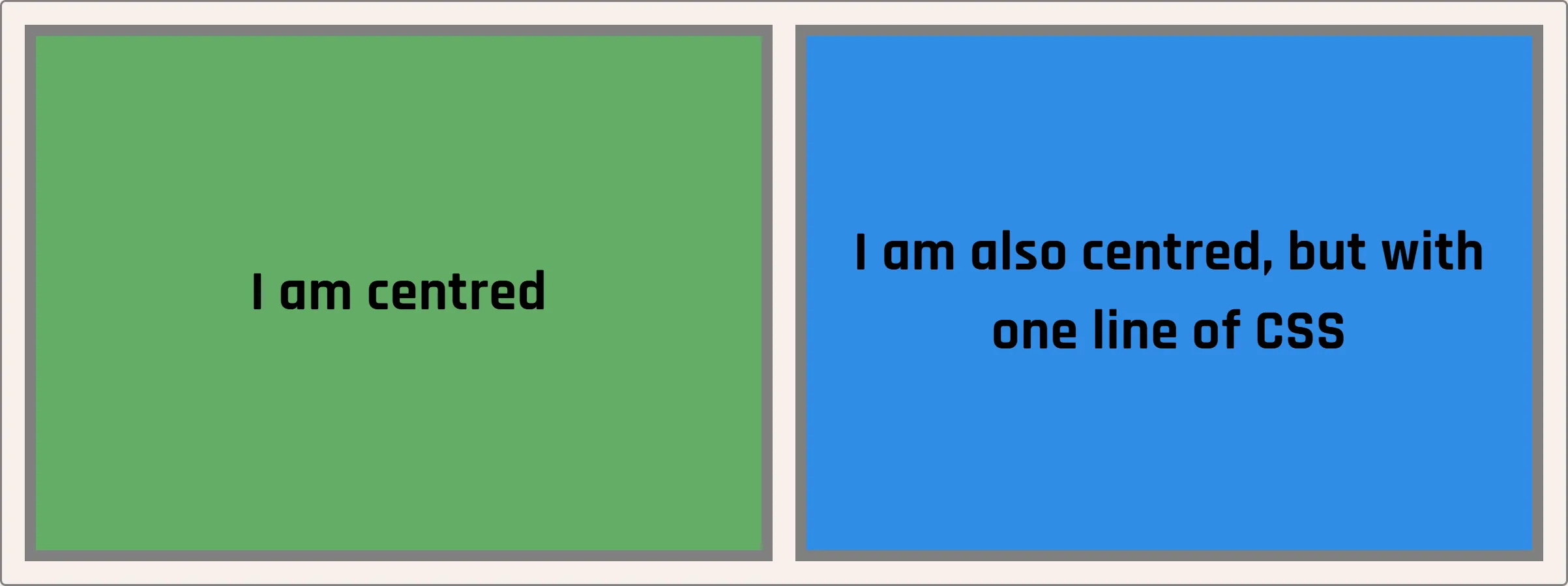
But what if I told you you didn’t need flexbox for this anymore? What if I told you that you could vertically centre with one line of CSS?
<div class="box old">
	I am centred
</div>
<div class="box new">
	I am also centred, but with one line of CSS
</div>
Here we have 2 boxes, both with vertically centred content
	.old {
		display: flex;
		align-items: center;
	}

	.new {
		align-content: center;
	}
While previously we would have to use flexbox, we can now use align-content on a block element and it will vertically centre the content
2 vertically centred boxes, but now with even less code being needed (which is super exciting, we haven’t had this since the days of table layouts)
2024 2024 2024 2024
Althoguh the property has been around for a while, it’s only recently been implemented for block elements rather than just for grid and flexbox
CSS Subgrid
Back in 2019 I spoke at the very first DDD Adelaide about CSS Grid and literally the day before my talk subgrid was launched in firefox
It’s gotten a bit better browser support since then, and can do some pretty cool things with CSS grid
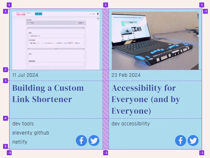
	<div class="container">
		<div class="card">
			<img src="/img/image.jpg" alt="" />
			<h2>Building a Custom Link Shortener</h2>
			<time>11 Jul 2024</time>
			<ul class="tags">
				<li>dev</li>
				<li>tools</li>
				<li>netlify</li>
			</ul>
			<ul class="share">
				<li><svg>...</svg></li>
				<li><svg>...</svg></li>
			</ul>
		</div>

		<div class="card">
			<img src="/img/image.jpg" alt="" />
			<h2><a href="/accessibility-for-everyone" target="_blank">Accessibility for Everyone (and by Everyone)</a></h2>
			<time>23 Feb 2024</time>
			<ul class="tags">...</ul>
			<ul class="share">...</ul>
		</div>
	</div>
Here we have a blog feed which has cards for each article
The cards each have an image, a title, a date, a list of tags and sharing links
Now with feeds like this, it’s normally a bit of a pain to get everything to line up nicely. The titles all have different lengths and some will have more tags than others so there are limits on how well things can be lined up across the grid
.container {
	display: grid;
	grid-template-columns: repeat(auto-fill, minmax(200px, 1fr));
}
Using CSS Grid on the feed container, we can define the overall layout of the grid and add in some auto-sizing columns
	.card {
		display: grid;
		grid-template-columns: repeat(2, 1fr);
		gap: 10px;
		grid-template-areas:
			'image image'
			'date .'
			'title title'
			'tags socials';
	}
Next we want to use grid to define the layout of the card, creating 2 columns
Using named areas we can lay the items out on the card, so the image spans both columns, the date sits above the title and the tags and socials sit next to one another at the bottom
We don’t have to create the rows just yet, but even without them the browser will infer the rows needed based off the template areas
	.card {
		img {
			grid-area: image;
		}

		h2 {
			grid-area: title;
		}

		time {
			grid-area: date;
		}

		.tags {
			grid-area: tags;
		}

		.share {
			grid-area: socials;
		}
	}
Next we can assign each of the named areas to the elemenets within the card
	.container {
		grid-auto-rows: 200px auto 1fr auto;
		// Image, Date, Title, Tags+Socials
	}

	.card {
		grid-template-rows: subgrid;
		grid-row: span 4;
	}
Lastly comes the subgrid magic
On the overall container we want to define a repeating set of rows for each card, the row sizes will be based off the card content in this case 200px for the image, auto sizing for the date, 1fr for the title so that will grow as needed and auto sizing for the tags and socials
We then set the card to span across 4 rows
And if we set the rows on the card to be subgrid, they will inherit the row sizing from the container
This will then ensure that the sizes of the rows are big enough for whatever content is on the card, and match up across the grid layout
Who here read the abstract for this talk? The whole thing?
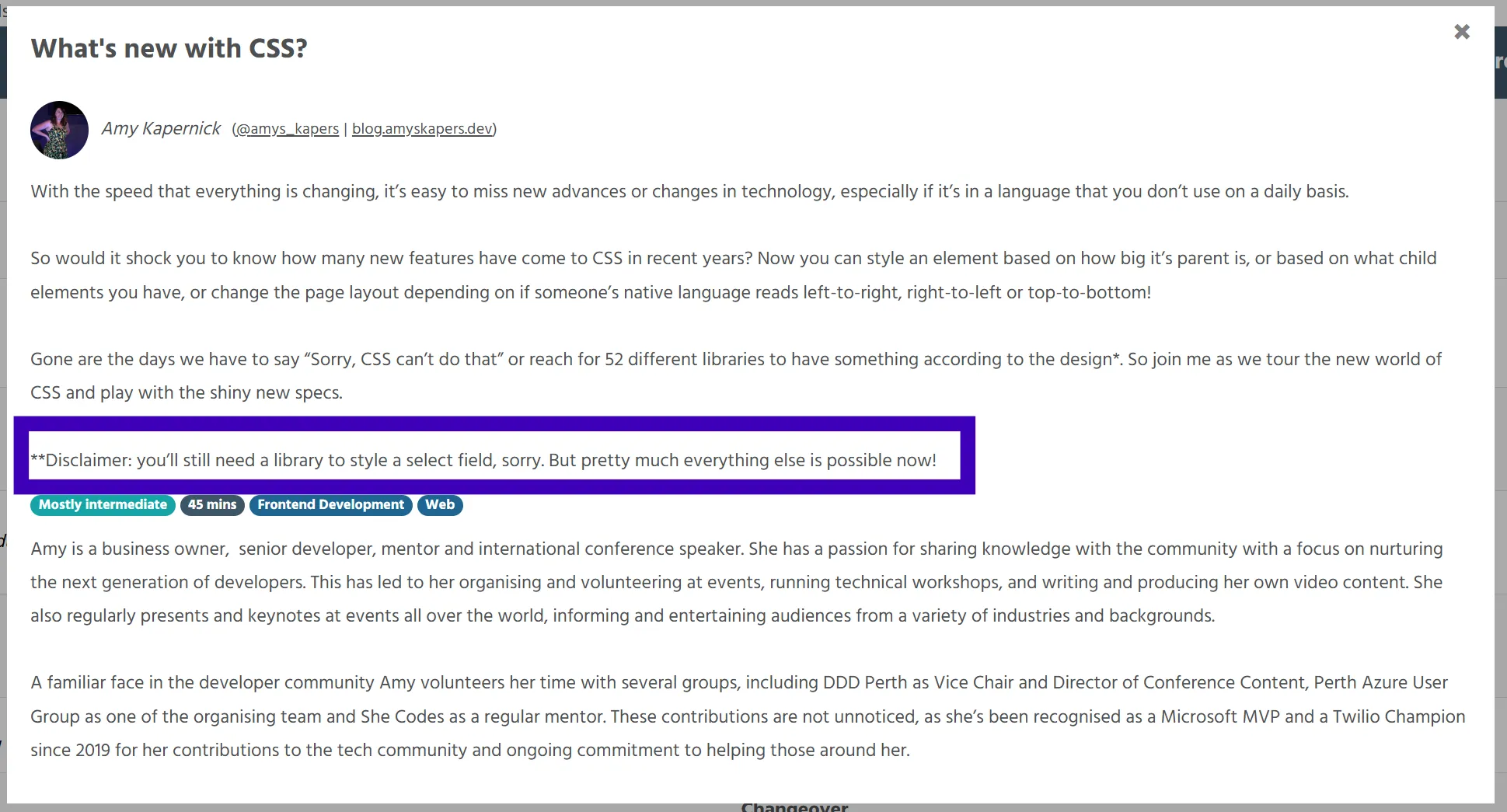
So when I started writing this talk I figured it was a shame that we couldn’t style select fields with CSS, but I have something to show you all
<label for="field_status">Lego Set Status</label>

<selectlist id="field_status" name="status">
	<button type="selectlist">
		<span class="sr-only">Select Tags</span>
		<selectedoption></selectedoption>
	</button>
	<listbox>
		<div class="options-container">
			<option value="" hidden>
				<span>Select Status</span>
			</option>
			<option value="assembled">
				<img src="img/assembled.jpg" alt="" />
				<span class="text">Assembled</span>
			</option>
			/* More options */
			<option value="unreleased">
				<img src="/img/new.jpg" alt="" />
				<span class="text">Unreleased</span>
			</option>
		</div>
	</listbox>
</selectlist>
We start with a label and the selectlist element which is an interactive container for the select list
Inside that we have a listbox which contains the options for the select
These options are much the same as we normally use for selects and datalists, but we can also add images and other elements inside them
We can use a button for the clickable element of the select field
And inside that button add a selectedoption element to be a container for the selected option of the select field
	selectlist {
		button {
			&[type="selectlist"] {
				padding: 0.5em;
				border-radius: 10px;
				margin: 0;
			}
		}

		.options-container {
			display: flex;
			flex-wrap: wrap;
		}
	}
	option,
	selectedoption {
		display: grid;
		border-radius: 10px;
		cursor: pointer;
		gap: 2px;
	}

	option {
		&:hover,
		&:focus {
			background: purple;
			color: var(--white);
		}

		&[hidden] {
			display: none;
		}
	}
All of these leemnets are then stylable via CSS, we can even use CSS grid on the option and selectedoption elements
The option elements will also take some hover and focus styles, rather than just the default browser styles and can be hidden if we wanted
This then gives us a visual select field, using image tiles and associated text labels
<selectlist id="context" name="context">
	<button type="selectlist">
		<selectedoption></selectedoption>
		<span class="sr-only"></span>
	</button>
	<listbox>
		<option value="" hidden><span>Select Action</span></option>
		<option value="commit">
			<svg>...</svg>
			<span>Commit</span>
		</option>
		<option value="merge">
			<svg>...</svg>
			<span>Merge</span>
		</option>
		<!-- More options here -->
	</listbox>
</selectlist>
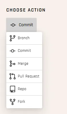
Or perhaps we want to display a context type menu, with a little more control over the styling of the items and the ability to add an icon to it
The concept is the same, we can add svg icons to the options and style the elements as we want with a bit of CSS
The result then gives us much more control over the styling of select fields
So in 2024, we can finally get excited about styling select fields
❌ ❌ 🚩2022 🚩2022
Yea so full disclosure this is a VERY VERY new thing right now, the selectlist element currently is only in Chromium based browsers and is behind a feature flag
So not ready to use in production, but is something we can now see being worked on and can start tinkering around with
And at the rate CSS is changing, hopefully it won’t be too long before we can start using this as well
CSS is changing
So despite what random anonymous people on the internet say, CSS is changing and it’s really exciting to see not only what we have now but what we have coming
Native Nesting :has :is :not :where color-scheme light-dark() align-content subgrid :user-invalid :user-valid color-mix() text-spacing-trim field-sizing position-anchor inset-area Scroll snap animation-timeline text-wrap: balance aspect-ratio word-break: autophrase @layer @scope @property @media (width >= 400px) @container
I only had 45min for this but there’s so much more that is happening with CSS
Try something new!
So try something new, find something new with CSS and give it a go
Questions?kapers.dev/feedback